Most marketing dashboards fail. Not because they lack data—because they have too much. Dozens of metrics refresh in real-time while teams struggle to answer basic questions: Is this working? Should we spend more here? What changed?
The fix isn’t more metrics. It’s fewer, better ones. Research shows effective dashboards contain 5-10 KPIs maximum—enough to guide decisions without drowning in noise. More than that, and attention fragments. Less than that, and you miss critical signals.
This guide covers 18 marketing KPIs worth tracking, organized by function. Not all belong on every dashboard—that’s the point. Pick the ones that answer your specific questions, ignore the rest.
What Makes a KPI Worth Tracking
A metric becomes a KPI when it meets three criteria:
- Actionable: You can do something about it. Pageviews aren’t actionable; conversion rate by traffic source is.
- Comparable: You can benchmark against past performance, competitors, or industry standards.
- Leading or lagging: It either predicts future outcomes (leading) or confirms past results (lagging). You need both.
“Sessions increased 15%” tells you nothing. “Organic sessions from commercial keywords increased 15% while conversion rate held steady” tells you your SEO investment is working.
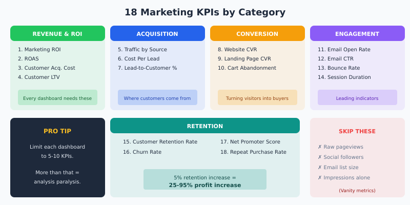
Revenue and ROI Metrics
These belong on every marketing dashboard. They connect marketing activity to business outcomes.
1. Marketing ROI
What it measures: Return generated per dollar spent on marketing.
Formula: (Revenue Attributed to Marketing – Marketing Cost) ÷ Marketing Cost × 100
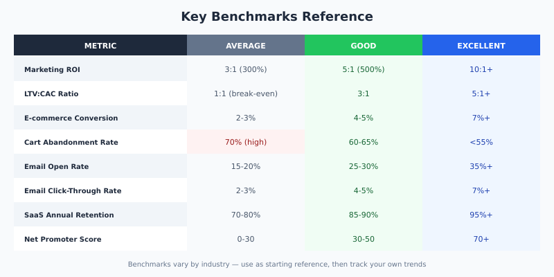
Benchmark: 5:1 ratio (500% ROI) is considered strong. 10:1 is exceptional. Below 2:1 signals problems.
A note on every benchmark in this guide: treat the ranges as orientation, not as measurements. They vary by industry, price point, sales cycle and season, and the only number that decides anything on your account is your own trailing baseline. Use these to spot an order-of-magnitude problem, then compare against yourself.
Watch out for: Attribution complexity. Multi-touch journeys make “revenue attributed to marketing” fuzzy. Pick an attribution model and stick with it for consistency, even if it’s imperfect.
2. Return on Ad Spend (ROAS)
What it measures: Revenue generated per dollar spent on advertising specifically.
Formula: Revenue from Ads ÷ Ad Spend
| Channel | Average ROAS | Good ROAS |
|---|---|---|
| Google Search | 2:1 | 4:1+ |
| Google Shopping | 3:1 | 5:1+ |
| Facebook/Instagram | 2:1 | 3:1+ |
| Retargeting | 4:1 | 8:1+ |
Advanced: Track Gross Margin ROAS (gmROAS) for e-commerce. A 4:1 ROAS on 20% margin products is worse than 2:1 ROAS on 60% margin products.
3. Customer Acquisition Cost (CAC)
What it measures: Total cost to acquire one new customer.
Formula: Total Marketing + Sales Costs ÷ Number of New Customers Acquired
| Industry | Average CAC |
|---|---|
| SaaS | $200-$500 |
| E-commerce | $45-$80 |
| Financial Services | $175-$300 |
| B2B Services | $300-$500 |
Critical ratio: CAC to Customer Lifetime Value (LTV). Healthy businesses maintain LTV:CAC of 3:1 or higher. Below 1:1 means you’re paying more to acquire customers than they’re worth.
4. Customer Lifetime Value (LTV/CLV)
What it measures: Total revenue expected from a customer over their entire relationship.
Formula (simple): Average Purchase Value × Purchase Frequency × Average Customer Lifespan
Formula (subscription): Average Monthly Revenue per Customer ÷ Monthly Churn Rate
Why it matters: LTV determines how much you can afford to spend on acquisition. A $50 CAC is expensive if LTV is $75, cheap if LTV is $500.
Related: Customer Journey Analysis shows where lifetime value is actually built, touchpoint by touchpoint.
Acquisition Metrics
Track these to understand where customers come from and how efficiently you’re attracting them.
5. Traffic by Source
What it measures: Volume of visitors segmented by acquisition channel.
Why source matters more than total: 10,000 visitors from branded search behave differently than 10,000 from social media. Segment by:
- Organic search (branded vs. non-branded)
- Paid search
- Paid social
- Organic social
- Referral
- Direct
Action trigger: If one source grows while conversion rate drops, you’re attracting lower-quality traffic. If volume drops but conversion rises, you may have lost reach but improved targeting.
6. Cost Per Lead (CPL)
What it measures: Cost to generate one qualified lead.
Formula: Total Campaign Cost ÷ Number of Leads Generated
| Industry | Average CPL |
|---|---|
| Technology | $35-$100 |
| Healthcare | $35-$85 |
| Financial Services | $45-$160 |
| Manufacturing | $30-$75 |
| Education | $25-$55 |
Better metric: Cost Per Qualified Lead (CPQL). Raw lead counts include junk. Filter for leads that meet qualification criteria before calculating.
7. Lead-to-Customer Conversion Rate
What it measures: Percentage of leads that become paying customers.
Formula: (Customers ÷ Total Leads) × 100
Benchmark: Varies wildly by industry and sales cycle. B2B SaaS: 2-5%. E-commerce (email leads): 10-15%. High-ticket B2B: 1-3%.
Diagnostic value: Low conversion rate with high lead volume suggests lead quality problems. High conversion rate with low volume suggests you’re only capturing bottom-funnel prospects.
Conversion Metrics
These reveal how well you turn attention into action.
8. Website Conversion Rate
What it measures: Percentage of visitors who complete a desired action.
Formula: (Conversions ÷ Total Visitors) × 100
| Conversion Type | Average Rate | Good Rate |
|---|---|---|
| E-commerce purchase | 2-3% | 4-5%+ |
| B2B lead form | 2-5% | 7-10%+ |
| SaaS free trial | 3-8% | 10-15%+ |
| Newsletter signup | 1-3% | 5%+ |
Segment this metric: Overall conversion rate hides important patterns. Track by traffic source, device, landing page, and user segment.
Related: Conversion Funnel Analysis breaks down conversion by funnel stage to identify specific drop-off points.
9. Landing Page Conversion Rate
What it measures: Conversion rate for specific campaign landing pages.
Why separate from website conversion: Landing pages serve specific campaigns with targeted traffic. Their conversion rate reflects campaign-message-audience fit, not overall site performance.
Benchmark: Top-performing landing pages convert at 10-15%. Median is around 4%. Below 2% signals message mismatch or UX problems.
Related: Conversion Funnel Analysis shows how to find the step where this metric leaks.
10. Cart Abandonment Rate
What it measures: Percentage of shoppers who add items to cart but don’t complete purchase.
Formula: (Abandoned Carts ÷ Total Carts Created) × 100
Benchmark: The average documented rate is 70.22%, which Baymard Institute derives from 50 separate studies. Mobile checkouts typically abandon at a higher rate than desktop, though Baymard publishes no separate figure for it — measure your own split rather than quoting one. Anything below 60% is doing well.
Action: Implement cart abandonment email sequences to recover part of those carts — and use funnel analysis to confirm where the drop-off starts.
Engagement Metrics
Leading indicators that predict future conversion and retention.
11. Email Open Rate
What it measures: Percentage of delivered emails that recipients open.
Formula: (Emails Opened ÷ Emails Delivered) × 100
| Email Type | Average Open Rate |
|---|---|
| Welcome emails | 50-60% |
| Newsletter | 15-25% |
| Promotional | 10-18% |
| Transactional | 60-80% |
| Cart abandonment | 40-45% |
Caveat: iOS 15+ privacy features inflate open rates by pre-loading images. Focus on click rate as a more reliable engagement signal.
12. Email Click-Through Rate (CTR)
What it measures: Percentage of email recipients who click a link.
Formula: (Clicks ÷ Emails Delivered) × 100
Benchmark: Average is 2-3%. Above 5% is strong. Segmented campaigns typically achieve 2-3x higher CTR than broadcast emails.
Better metric: Click-to-Open Rate (CTOR) = Clicks ÷ Opens. This isolates email content effectiveness from subject line effectiveness.
13. Bounce Rate
What it measures: Percentage of visitors who leave after viewing only one page.
Benchmark: Varies by page type. Landing pages: 70-90% (expected). Blog posts: 65-80%. Product pages: 20-40%. Homepage: 40-60%.
When high bounce is fine: If visitors find what they need on one page (contact info, specific answer), high bounce isn’t bad. Pair with time on page and scroll depth for context.
14. Average Session Duration
What it measures: Average time visitors spend on your site per session.
Benchmark: 2-3 minutes is average. Content sites aim for 3-5 minutes. E-commerce: 3-4 minutes indicates browsing; under 1 minute suggests poor relevance.
Pair with: Pages per session. High duration + few pages = engaged reading. High duration + many pages = active shopping/research.
Retention Metrics
Acquiring customers costs more than keeping them. These metrics track relationship health.
15. Customer Retention Rate
What it measures: Percentage of customers retained over a period.
Formula: ((Customers at End – New Customers) ÷ Customers at Start) × 100
Benchmark: Varies dramatically by industry. SaaS: 85-95% annual. E-commerce: 20-40% annual. Subscription boxes: 60-80% annual.
Impact: A 5% increase in retention can increase profits by 25-95% (Bain & Company). Small improvements compound significantly.
16. Churn Rate
What it measures: Percentage of customers lost over a period.
Formula: (Customers Lost ÷ Customers at Start) × 100
| Business Type | Average Monthly Churn | Good Churn |
|---|---|---|
| B2B SaaS | 3-5% | <2% |
| B2C SaaS | 5-7% | <4% |
| Consumer subscriptions | 6-10% | <5% |
Revenue churn vs. customer churn: Losing one enterprise customer hurts more than losing ten small ones. Track both metrics.
17. Net Promoter Score (NPS)
What it measures: Customer loyalty and likelihood to recommend.
Formula: % Promoters (9-10 rating) – % Detractors (0-6 rating)
Benchmark: Above 0 is acceptable. Above 30 is good. Above 50 is excellent. Above 70 is world-class.
Leading indicator: NPS predicts retention and referral behavior. Declining NPS signals future churn even if current retention looks healthy.
18. Repeat Purchase Rate
What it measures: Percentage of customers who make more than one purchase.
Formula: (Customers with 2+ Purchases ÷ Total Customers) × 100
Benchmark: E-commerce average is 25-30%. Top performers reach 40-50%.
Why it matters: Second purchase is the hardest. Customers who buy twice are significantly more likely to buy again. Focus retention efforts on driving the second purchase.
Building Your Dashboard: Role-Based Views
Different stakeholders need different metrics. One dashboard rarely serves everyone.
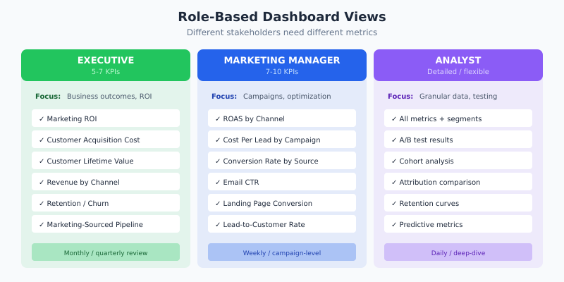
Executive Dashboard (5-7 KPIs)
Focus: Business outcomes, trends, ROI.
| KPI | Why Executives Need It |
|---|---|
| Marketing ROI | Overall efficiency of marketing investment |
| Customer Acquisition Cost | Cost discipline, unit economics |
| Customer Lifetime Value | Long-term customer value |
| Revenue by Channel | Channel investment decisions |
| Retention Rate / Churn | Business health indicator |
| Marketing-Sourced Pipeline | Sales alignment |
Marketing Manager Dashboard (7-10 KPIs)
Focus: Campaign performance, channel optimization, conversion.
| KPI | What It Guides |
|---|---|
| ROAS by Channel | Budget allocation decisions |
| Cost Per Lead by Campaign | Campaign optimization |
| Conversion Rate by Source | Traffic quality assessment |
| Email CTR | Content and offer effectiveness |
| Landing Page Conversion | Message-market fit |
| Lead-to-Customer Rate | Lead quality and nurture effectiveness |
| Cart Abandonment Rate | Checkout optimization priority |
Analyst Dashboard (Detailed)
Focus: Granular data, segments, testing results.
- All metrics above, plus segmentation by audience, geography, device
- A/B test results and statistical significance
- Cohort analysis and retention curves
- Attribution model comparisons
- Predictive metrics (if available)
Common Dashboard Mistakes
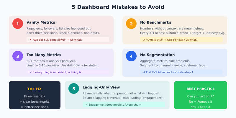
Mistake 1: Vanity Metrics
Pageviews, social followers, and email list size feel good but don’t drive decisions. They’re inputs, not outcomes. Track metrics that connect to revenue or retention.
Mistake 2: No Benchmarks
A 3% conversion rate means nothing without context. Is that good? Improving? Worse than competitors? Every KPI needs comparison points: historical trend, target, and industry benchmark.
Mistake 3: Too Many Metrics
Dashboards with 30+ metrics create analysis paralysis. If everything is important, nothing is. Limit to 5-10 KPIs per view. Use drill-downs for detail, not the main dashboard.
Mistake 4: No Segmentation
Aggregate metrics hide problems. A flat conversion rate might mask mobile declining while desktop improves. Segment every metric by channel, device, and customer type.
Mistake 5: Lagging-Only View
Revenue and conversions tell you what happened. Engagement and pipeline metrics predict what will happen. Balance both for proactive decision-making.
Tools for Marketing Dashboards
All-in-one platforms:
- HubSpot, Marketo: Built-in reporting with CRM integration
- Google Looker Studio: Free, connects to Google ecosystem
Dedicated dashboarding:
- Klipfolio, Databox: Multi-source marketing dashboards
- Tableau, Power BI: Enterprise-grade visualization
Analytics foundations:
- GA4: Web analytics baseline
- Mixpanel, Amplitude: Product and behavioral analytics
- Plausible: Privacy-first alternative
Continue Learning
- Conversion Funnel Analysis — deep-dive into conversion metrics by funnel stage
- First-Party Data Strategy — the data you need before segment-level KPIs mean anything
- Multi-Touch Attribution Models — how to credit the channels behind these numbers
- Analytics Audit Checklist — verify the data feeding these KPIs is not quietly broken
Bottom Line
The best marketing dashboard isn’t the one with the most metrics. It’s the one that answers your specific questions quickly. Start with revenue and ROI metrics—these justify marketing’s existence. Add acquisition and conversion metrics to optimize spend. Include engagement and retention metrics to predict future performance.
Limit each dashboard view to 5-10 KPIs. Make sure every metric has a benchmark and an owner. If you can’t act on a metric, remove it.
Dashboards don’t create insights—they surface data. The insights come from asking “why” when metrics move and “what if” when planning changes. Build dashboards that make those questions easy to ask and answer.