The Psychology Behind High-Converting Landing Pages
If a landing page converts, it’s rarely by accident. It aligns with how people actually decide: fast, emotional shortcuts first; rational justification second. This article distills the core psychological principles behind high-converting pages—and shows how to translate them into design, copy, and experiments grounded in behavioral data.
Start with first principles: clarity beats clever
Processing fluency—how easy something is to understand—predicts trust and action. Visitors scan, don’t read. In the first five seconds, they should grasp:
- What this is
- Why it’s valuable (benefit)
- What to do next (primary CTA)
Practical moves:
- Write a literal headline (“Bookkeeping software that closes your month 5× faster”), then a one-line proof under it.
- Keep the hero section free of competing buttons; one primary CTA is enough.
- Match “ad scent”: repeat the promise, keywords, and imagery from your ad/email to reduce cognitive dissonance.

Metrics to watch: time to first click, hero CTA click-through, scroll depth drop-off after the hero. Tools: event tracking in GA4, heatmaps, session replays. For a complete list of metrics worth tracking, see our guide on marketing KPIs.
Reduce friction: fewer steps, fewer doubts
People abandon when effort feels high or risk feels opaque.
- Cognitive load: Chunk information. Use short paragraphs, scannable bullets, visual hierarchy (biggest to smallest).
- Ambiguity aversion: Make pricing, next steps, and trial terms explicit. If it’s a demo, say what happens after they submit.
- Risk reversal: Guarantees, free cancellations, or “no credit card required” reduce loss aversion.
Test ideas:
- Replace “Submit” with action-specific labels (“Get my demo”).
- Surface FAQs inline near the form, not buried at the footer.
- Show trust signals (security badges, data privacy statements) within 100px of the form.
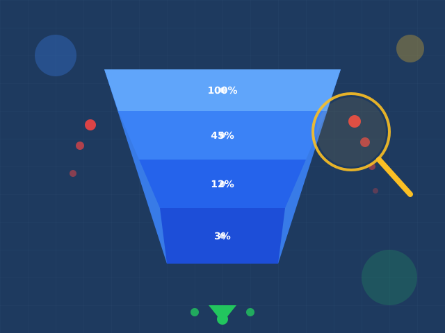
Metrics: form completion rate, field-level drop-off, error rate, rage-clicks on unclear elements. Understanding where visitors abandon is the foundation of conversion funnel analysis.

Build trust fast: social proof and authority (used ethically)
Humans borrow confidence from others.
- Social proof: Logos, review counts, star ratings, case study snippets with numbers (“Cut onboarding time by 43%”).
- Authority signals: Certifications, media mentions, awards—only if relevant.
- Similarity bias: Feature testimonials from segments that match the visitor’s industry or role.
Personalization idea: Swap testimonial blocks by UTM industry or firmographic data. This is a practical application of audience segmentation. Measure uplift by segment; avoid over-personalization creepiness.

Shape choices: design the decision, not just the page
Choice architecture nudges action without deception.
- Single primary action: Minimize secondary links that leak attention (docs, blog, pricing) above the fold unless the goal is research.
- Defaults and decoys: For pricing pages, preselect the most popular plan. Consider a decoy tier that makes the target tier look superior.
- Progressive disclosure: Don’t ask for everything at once. Start with email → then profile details post-sign-up.
Watch out: These patterns must be honest. Scarcity or countdowns should reflect real inventory or deadlines.

Use motivation triggers—grounded in value, not hype
- Loss aversion: Frame benefits as avoiding costs (“Stop losing 10% of ad spend to duplicate tracking”).
- Reciprocity: Give useful assets (templates, calculators) before asking for more data.
- Urgency: Real deadlines, not endless timers. Pair with an “ends on [date]” subline.
- Anchoring: Show the “typical alternative” cost/time next to your offer to create contrast.
Metric linkage: promo pages with urgency should show a lift in same-session conversions without spiking refunds or churn later. Track cohort quality (trial-to-paid, retention) to avoid empty calories.
Write for brains, not robots: copy that resolves objections
Good landing copy mirrors the customer’s inner dialogue.
- Headline = outcome, subhead = mechanism. “Ship features faster” (outcome). “Automate QA with visual diff testing” (mechanism).
- Benefits → features → proof. Sequence sections so each claim is backed by a screenshot, stat, or quote.
- Objection handling: Price, integration effort, timeline, data migration, security—treat each with one clear paragraph and a link to details.
Microcopy wins:
- Replace fear-inducing labels (“Credit card”) with clarifiers (“No charge until day 15”).
- Inline form validation that praises success (“Looks good!”) reduces anxiety and backtracks.
Form psychology: get the yes, then earn the data
Every extra field is a negotiation.
- Endowed progress effect: Progress bars and “Step 1 of 2” labels improve completion.
- Commitment & consistency: Start with low-friction asks (email) before larger ones (phone, budget).
- Default effect: Pre-check consent for product updates only if compliant—and be explicit about value.
Instrument field timings to spot “killer fields” (e.g., phone) and test moving them post-conversion.
Visual hierarchy and attention cues
Eyes follow contrast and direction.
- Make the CTA the highest-contrast element on the viewport—size, whitespace, and color all matter.
- Directional cues: Arrows, gaze direction in hero images, or angled elements that point to the CTA.
- Mobile thumb zones: Place primary actions within reachable areas; keep sticky CTAs on long pages.
Measure: click maps, viewport CTR, mobile vs desktop deltas. If mobile trails, suspect reachability and load.
Data-driven iteration: psychology × evidence
Psychology provides hypotheses; experiments provide truth.
- Define the decision: What user decision is this section trying to win?
- Map friction/motivation: Hypothesize the bias at play (e.g., ambiguity aversion on pricing).
- Design the variant: One psychological change at a time (e.g., add “What happens next” module).
- Guardrails: Minimum sample sizes, even exposure, holdout segments. Track primary conversion and quality metrics (SQL rate, CAC, churn proxy).
Useful diagnostics:
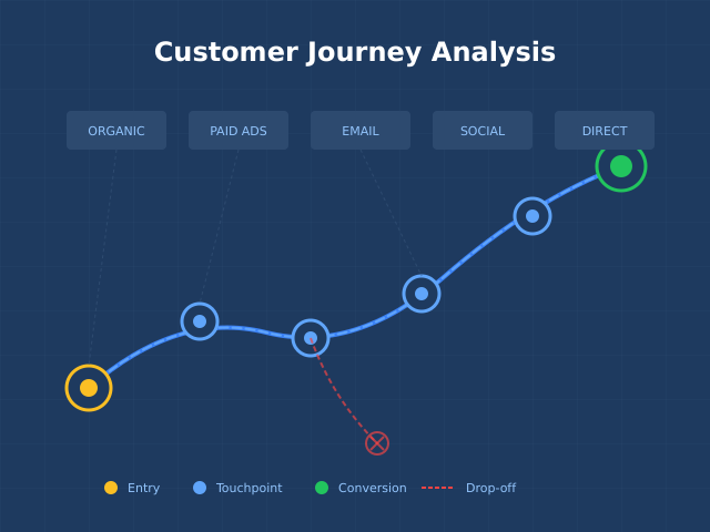
- Segment by intent (brand vs non-brand, competitor terms). See our customer segmentation examples for practical approaches.
- Attribute by landing page and section engagement (scroll to FAQ, watched testimonial).
- Compare first-session conversion to 7-day conversion to catch delayed influence.

Blueprint you can reuse (and A/B)
Hero (0–600px):
- Clear promise + concrete subhead
- One high-contrast CTA
- Reinforcing visual (product in context, not abstract art)
- 3–5 trust logos
Proof strip:
- Numbered outcome tiles (“–43% time to value”)
Why it works:
- 1–2 screenshots with callouts tied to benefits
Objections handled:
- Short answers to price, setup time, integrations, security; link to deep pages
Social proof:
- Role/industry-matched testimonials with names and results
Offer + risk reversal:
- Free trial or guarantee, transparent terms
Form with microcopy and progress cues
- Minimal fields; inline validation; privacy reassurance
Common pitfalls to avoid
- Pretty but vague: Slick visuals that say nothing.
- CTA salad: Too many buttons competing for attention.
- Fake urgency: Damages brand and long-term conversion.
- Copy without proof: Claims unmoored from numbers.
- Ignoring mobile reality: Desktop-first layouts that bury CTAs on phones.
Continue Learning
To track your landing page performance effectively, see our guide on marketing KPIs worth tracking. For understanding where visitors drop off, read about conversion funnel analysis.
Bottom line
High-converting landing pages don’t “trick” people—they reduce friction, resolve doubt, and make value obvious at a glance. Use psychology to form strong hypotheses, then let behavioral data confirm—or kill—them. Ship small, honest improvements, measure beyond the click, and your conversion rate will compound.